

Responsive Website Design | UX Design
Project Overview
The Product
Dogs Land is a dog adoption organization that offers personalized dog adopting services. It is committed to providing clear and thorough dogs adopting services for users.
The Challenge
Available pets adoption websites have confusing adopting process, limited personalized options and insufficient adopting information.
The Goal
Design a Dogs Land website to be user friendly by providing a clear user flow, more adequate contents, and more personalized options.
My Role
UX Designer, UX Researcher
My Responsibilities
User research
Paper and digital wireframes
Low and high-fidelity prototyping
Usability study
Iterating on designs
Project Duration
September to October 2021
Understanding the User
User Research: Summary
To understand our users’ needs, I interviewed with 6 participants who have previous experiences using pet adoption websites. I discovered that many children’s parents and single career professionals have the need to adopt a dog to keep company with.
However, many existing pets adoption websites have insufficient and confusing adoption flow, and miss vital information for user reference, which frustrated many target users. This caused a major challenge for users to adopt a dog they desire.

User Pain Points
User Flow:
Application flow on platforms is not clear.
Feature:
Adopting selections on platforms are not personalized.
Content:
Important information about pets are missing on platforms.
Persona
With research data from user interviews and secondary research, I created two personas to be the representatives of the target users: Heather and Jackson. I continuously placed myself in Heather’s and Jackson’s “shoes” to empathize with them throughout the design process.


User Journey Map
I mapped out Heather’s journey to form a holistic and deeper understanding of users’ needs, which inspired me the core and goal of my design.

Competitive Audit
To create a solid web design strategy before starting the design, I evaluated three pet adoption websites from various perspectives, including features, experience, user flow, navigation, visual elements and website contents.

Starting the Design
Site Map

Paper Wireframe
I took the time to sketch out paper wireframes, keeping the user pain points about user flow, features and contents in mind. Because Dogs Land’s users access the site on a variety of different devices, I also worked on designs for different screen sizes to make sure the site would be responsive.
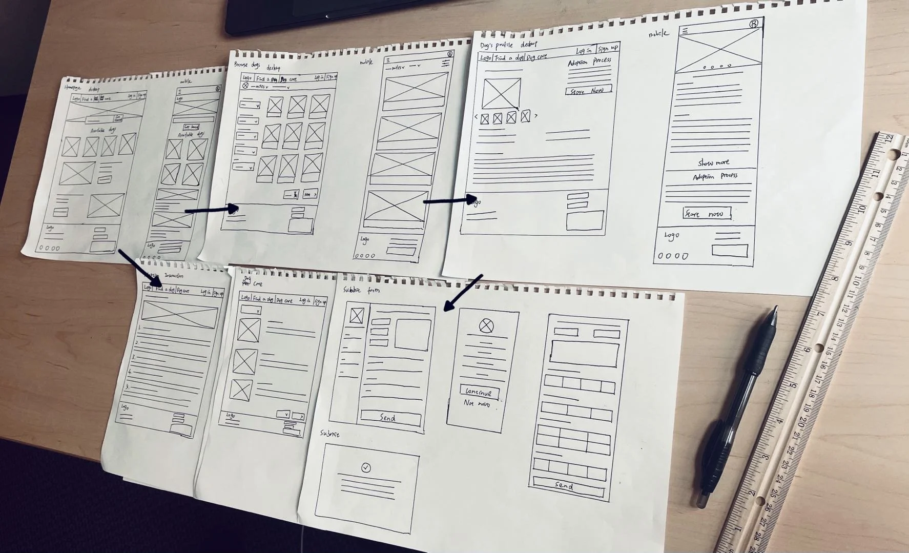
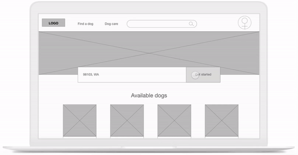
Digital Wireframe
Moving from paper to digital wireframes made it easy to understand how the design could help address user pain points and improve the user experience. Optimizing user flow and personalized options were key parts of my strategy.

I made sure to consider different screen size variation(s) when designing digital wireframes.

Low-fidelity Prototype
To create a low-fidelity prototype, I connected all of the screens involved in the primary user flow of browsing and finding a dog, as well as submitting adopting application.
Usability Study
With my lo-fi prototype on Adobe XD, I conducted a round of remote, moderated usability study. Through usability study, I hope to understand:
If users can complete core tasks within the Dogs Land websites.
if the website is difficult to navigate.
Findings:
Navigation:
Users find trouble going back to the homepage through the navigation bar.
User Flow:
During the application process, existing user information weren’t able to automatically fill in.
Don’t know what to expect after submitting the application.
Interaction:
Users find it hard to notice the “Start application now” button.
Refining the Design
Refining Details


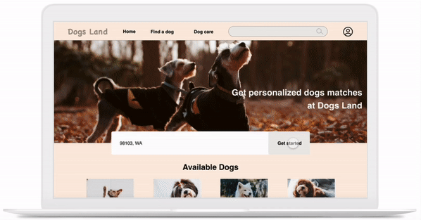
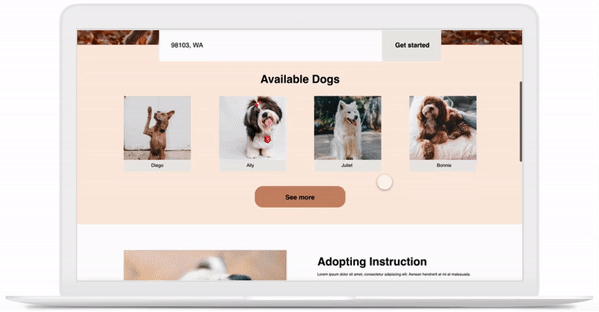
Mockups

I included considerations for additional screen sizes in my mockups based on my earlier wireframes. Because users browse from a variety of devices, I felt it was important to optimize the browsing experience for a range of device sizes so users have the smoothest experience possible.

High-fidelity Prototype
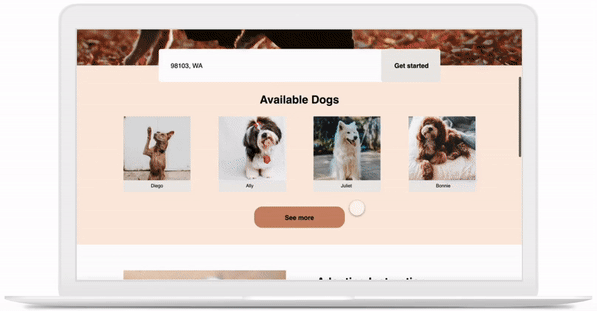
01 Clear user flow
The hi-fi prototype provided users with customer-tailored filters to search for a dog, as well as a clearer user flow for submitting adopting application.
02 Thorough instruction
Users are able to view thorough and detailed instruction on dogs adoption and get a clear sense of how the adopting process would take place.
03 A wide range of information
The site would feature all types of dog care articles to help users prepare with dog adoption. Users could also personalize article categories based on their needs.
Going Forward
Takeaways
Impact:
Our target users shared that the design was intuitive to navigate through, and demonstrated a clear user flow.
One quote from peer review:
“The main user flow is easy to understand, and the overall visual elements of the site is compelling and engaging! Keep going!”
What I learned:
I learned that even a small design change can have a huge impact on the user experience. The most important takeaway for me is to always focus on the real needs of the user when coming up with design ideas and solutions.
Next Steps
Conduct another round of user testing to validate whether the user pain points have been effectively addressed.
Identify any additional areas of need and iterate on new features.