
UW DRS - Website Design for UW Disabled Students
Accessible Design | Usability Test | Web Design & Development
Project Overview
The Project
This is the project I worked on when I was a UX & Web Designer at UW Disability Resources for Students (DRS), a department dedicated to ensure access and inclusion for all disabled students at the University of Washington.
UW DRS planned to put a new Academic Skills section on its website, which will share a wide range of information and resources to help all students with disabilities improve their academic performance and learn how to better utilize their academic accommodations.
I was responsible for the design of this part of website to make sure it’s accessible and user-friendly. It’s worth mentioning that in this project I not only designed but also worked in the back-end to build the website.
The Challenge
Most pages of the site are content-heavy, but many disabled students have difficulties viewing text-heavy web pages.
Students with different disabilities may have very different needs, which made it hard to identify and summarize unified user needs.
“How might we provide an inclusive, accessible and useful web experience for all students with disabilities at the University of Washington?”
Team
1 Project Manager
1 Content Writer
1 UX Designer (Me)
1 Graphic Designer
1 Web Developer
My Responsibilities
UX Design
Visual Design
Content Design
Web Development
User Testing
Auditing & Designing
The website was first created in Google Site before the Prototype phase. The first stage of my work was to conduct a complete content audit of all web pages and implement some design strategies to make the experience more accessible and enjoyable.
Simplify Content
1. Summary On Top
I added summaries on top of some content-heavy pages to give users an overview, and help them identify the information they need.

2. Clearer Content Structure
I utilized different heading levels, bold function and bullet points to break down long paragraphs, to make them more readable.

Improve IA
The website has large amounts of information to display, but the first version of Information Architecture (IA) failed to provide clear paths through content, and the word choices were not informative enough. After content auditing, I adjusted the IA to organize content more effectively.
Add Visual Elements
I added graphics and/or infographics to make the experience more delightful, and to help users better understand some complex concepts and techniques.


Building & Checking
The second stage of my work was to build the website prototype in WordPress. I made some design refinements along the way, and ran a thorough accessibility check to make sure the experience is inclusive and accessible to all users.
Accessibility Check
Include text version of content for all graphics and PDFs.

Check image alt text.

Provide descriptive links.

Testing & Refining
Usability Testing
Background:
After creating the prototype in WordPress, I wrote a usability script to run a test with 6 students with different disabilities (participants don’t need to disclose their diagnosis and/or accommodations during the test). Through the test, we mainly hope to understand:
If students can find the information they need on the website.
If the website is too content-heavy.
Note analysis:
Key recommendations:
Improve IA to organize and label content more effectively.
Make titles more concise and intuitive.
Change banner to improve accessibility.
Use accordion to improve content structure.
Updated IA
During the test, we asked participants to find certain content (i.e., time management tips, reading strategies, etc.) and discovered that it’s difficult to find certain info based on the earlier IA. Participants also pointed out that some titles are too long and some sections contain too many pages, which made it harder for them to find the content. Additionally, we asked participants to talk about the parts and/or content they’re most interested in after they browsed the whole site. Based on all the insights, we created this new IA to provide clearer paths for users to navigate the site.
Design Highlights
Smooth Navigation
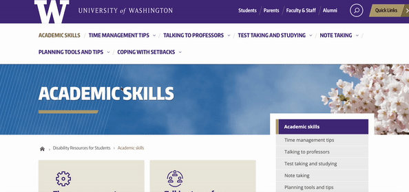
Clear IA and intuitive menu and page titles to help users navigate the site smoothly and find the content they need efficiently.
Clear Content Layout
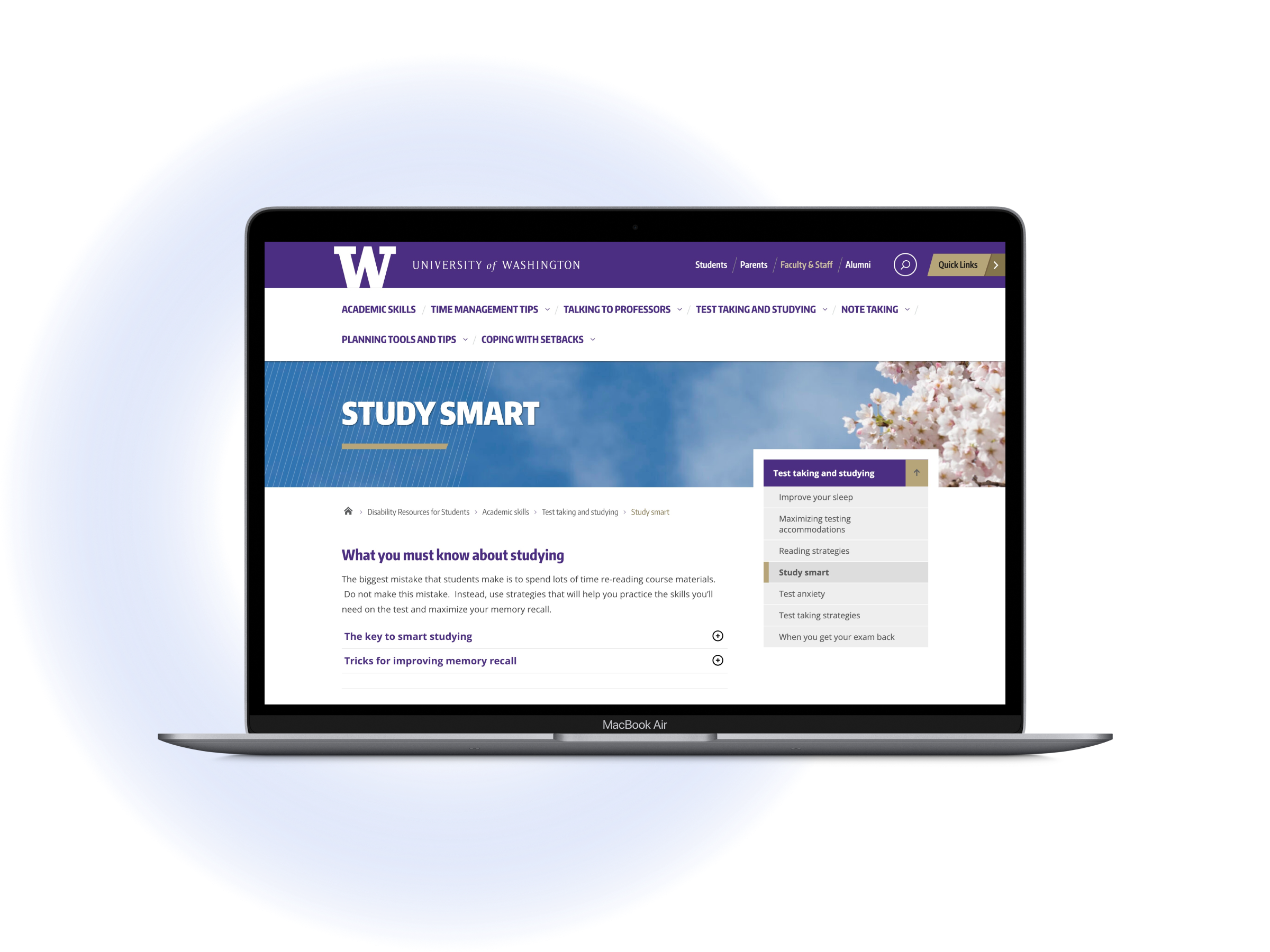
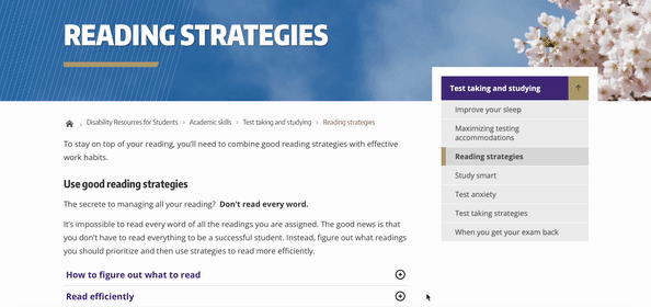
Use accordion to further break down text-heavy pages, and help users browse content accurately.
Ensure Accessibility
Use graphics to lighten the read load, but also ensure all users have access to the content.

Going Forward
Reflections
This project provided me with an invaluable experience to work with students with different disabilities and learn more about accessibility design. I learned how to ensure accessibility throughout the project, which I believe will be highly beneficial for my future design work.
Because the process of recruiting disabled student participants was very complex and involved the coordination work with many staffs at UW, we didn’t start user testing until we’ve created a complete prototype in WordPress. This led to some recurring and tedious work in WordPress late on. Next time I will start to conduct some simple user testings at earlier stages of design to improve efficiency and to ensure the project is working toward the right direction.